#Bootstrap Admin Grid Template
Explore tagged Tumblr posts
Visit Tumblr Blog
Explore Tumblr blogs with no restrictions, modern design and the best experience.
Last Seen Tumblr Blogs


Fun Fact
Tumblr Inc. is using 66 technologies for its website.
Text
A Guide to the Best CSS Frameworks for Web Developers
CSS frameworks are an essential tool for modern web development, enabling developers to create responsive, mobile-friendly websites with less effort. They come with pre-built grids, styles, and UI components, saving developers time and allowing them to focus on functionality and user experience. In this article, we’ll explore some of the top CSS frameworks that are widely used in the industry today.
1. Bootstrap
Overview:
Bootstrap is the most well-known CSS framework and has been a popular choice among developers for many years. It provides a rich set of UI components, a responsive grid system, and a consistent design language, making it an ideal choice for rapid development.
Key Features:
Responsive Grid System: Bootstrap's 12-column grid is flexible and adapts to different screen sizes, making it easy to create responsive layouts.
Pre-designed UI Components: Includes buttons, forms, carousels, and navigation bars that are ready to use.
Extensive Documentation: One of the reasons for Bootstrap's popularity is its comprehensive documentation, making it easy for developers to get started.
Customizable via Sass: Developers can easily customize the framework using Sass variables.
Use Case:
Bootstrap is a go-to choice for building responsive websites quickly, making it suitable for beginners and experienced developers alike. It is commonly used for creating corporate websites, landing pages, and admin dashboards.
2. Foundation
Overview:
Foundation by Zurb is a robust CSS framework designed for professional developers who need flexibility and control over their projects. It’s built with a mobile-first philosophy, ensuring that designs are fully responsive right out of the box.
Key Features:
Advanced Grid System: Foundation’s grid system is highly customizable, giving developers more control over layouts.
Mobile-first Design: Every element is optimized for smaller screens and can easily scale up for larger devices.
Comprehensive UI Components: Offers pre-built components like dropdown menus, buttons, forms, and more.
Foundation for Emails: In addition to web development, Foundation also has a version tailored for creating responsive email templates.
Use Case:
Foundation is ideal for larger projects where flexibility is important. It’s widely used for enterprise-level websites, web applications, and complex projects that require a mobile-first approach.
3. Tailwind CSS
Overview:
Tailwind CSS is a utility-first framework that provides developers with low-level CSS classes, offering maximum flexibility to design their projects without predefined styles or components. Unlike traditional frameworks, Tailwind allows developers to apply styles directly in their HTML, giving them full control over the look and feel of their sites.
Key Features:
Utility-first Classes: Tailwind’s utility classes allow developers to style elements quickly without writing custom CSS.
Highly Customizable: Developers can override default settings to create their own themes and styles.
Responsive Design Utilities: Tailwind makes it easy to apply different styles based on screen size using responsive utility classes.
Minimal Overhead: Tailwind doesn’t come with pre-built UI components, keeping the framework lightweight.
Use Case:
Tailwind is perfect for developers who want to create unique designs without relying on predefined components. It’s ideal for projects that require a lot of customization and creativity, such as web apps and portfolio sites.
4. Bulma
Overview:
Bulma is a lightweight, modern CSS framework that is built on Flexbox. It’s known for its simplicity and ease of use, making it a great option for developers who want a minimalistic approach to web design.
Key Features:
Flexbox-based Grid: Bulma uses Flexbox for its grid system, which makes creating responsive layouts a breeze.
Clean Syntax: Bulma offers a clean and readable CSS structure, making it easy for developers to work with.
Pre-styled Components: Provides simple UI components such as buttons, cards, and navigation menus.
No JavaScript Dependencies: Bulma focuses purely on CSS, making it compatible with any JavaScript framework or library.
Use Case:
Bulma is an excellent choice for developers who want a minimalist, clean design with modern UI components. It’s well-suited for smaller projects, landing pages, and personal websites.
5. Materialize CSS
Overview:
Materialize is a CSS framework based on Google’s Material Design principles. It provides developers with ready-made components that follow Material Design guidelines, allowing them to create clean and intuitive user interfaces.
Key Features:
Material Design Components: Includes all the standard Material Design components such as cards, buttons, and navigation bars.
Responsive Grid: Like Bootstrap, Materialize uses a 12-column grid that helps in creating fluid, responsive layouts.
Interactive Elements: Comes with built-in JavaScript components like sliders, modals, and parallax effects.
Sass Support: Materialize is built using Sass, making it highly customizable.
Use Case:
Materialize is perfect for developers looking to implement Google’s Material Design system in their projects. It’s commonly used for web apps, portfolios, and other projects where a clean, modern design is essential.
Conclusion
Each CSS framework offers its own set of features and benefits, so the right one for you depends on the specific requirements of your project. Bootstrap is a versatile and popular choice for most websites, while Foundation is great for more advanced, flexible designs. Tailwind CSS gives developers the freedom to create custom designs, while Bulma offers a lightweight, minimalist option. Lastly, Materialize is perfect for those who prefer Google’s Material Design aesthetic.
1 note
·
View note
Text
Power Up Your Blazor Project: Unveiling the Top 5 Admin Themes for Ultimate Efficiency

In the ever-evolving landscape of web development, enhancing the visual appeal and functionality of your Blazor project is paramount. In this blog, we delve into the realm of ultimate efficiency by unveiling the top 5 admin themes specially curated for Blazor applications.
1. AdminLTE Blazor Theme
ADMINLTE for Blazor is a collection of reusable components, with which you can easily develop digital services as a designer or developer. Think of buttons, form elements and page templates. This project adapts ADMINLTE 3 so the components can be used from dotnet core Blazor.
AdminLTE is a popular open source WebApp template for admin dashboards and control panels. It is a responsive HTML template that is based on the CSS framework Bootstrap 3
Key Features:
Responsive design
Customizable color schemes
Integrated charting libraries

2. MudBlazor Material Theme
MudBlazor is a versatile Blazor component library, and its Material Theme brings the familiar Material Design principles to your admin interface. With a focus on simplicity and usability, this theme ensures a modern and intuitive user experience.
MudBlazor offers a rich set of UI components such as buttons, forms, dialogs, grids, cards, navigation elements, and more. These components are designed to be easy to use and provide a consistent look and feel across your application.
Key Features:
Material Design aesthetics
Extensive component library
Responsive layout

3. Radzen Blazor Theme
Radzen is a comprehensive set of tools for Blazor development, and its pre-built themes are a standout feature. The Blazor Theme from Radzen offers a polished and professional look, making it suitable for enterprise-level applications.
The Appearance panel in Radzen Blazor Studio provides a comprehensive interface for easily customizing the global look and feel of your application in real time.
Key Features:
Enterprise-ready design
Support for high-level charts
Customizable styling

4. Syncfusion Blazor Dashboard:
Syncfusion Blazor Dashboard is a grid-structured layout component that helps create static and dynamic dashboard layouts with panels. Dashboard panels are the basic building blocks of a dashboard and can be added programmatically or dynamically at runtime. The panels hold UI components and allow resizing, reordering, dragging and dropping, removing, and adding. Easily place components at the desired positions within the grid layout.
The dashboard layout is designed to automatically adapt with lower resolutions by transforming the entire layout into a stacked one. So that, the panels will be displayed in a vertical column. By default, whenever the screen resolution meets 600px or lower resolutions this layout transformation occurs. This transformation can be modified for any user defined resolution by defining the MediaQuery property of the component.
Key Features:
Dashboard-specific components
Real-time data support
Seamless integration

5. Blazorise Theme:
Blazorise is an excellent library that I’ve been using a lot lately. While it has great support for declaring custom visual themes, you’ll occasionally run into situations where what you’re trying to do isn’t fully supported.
Easily change the colors of your application programmatically. Rebuild the default stylesheet and customize various aspects of the framework for your particular needs.
Key Features:
Dark mode aesthetics
Blazorise component integration
Responsive layout

Ready to unlock the full potential of Blazor for your product development? Facile Technolab, top Blazor Development Company in India providing Blazor development services can help you bring your vision of product mvp to reality.
1 note
·
View note
Text
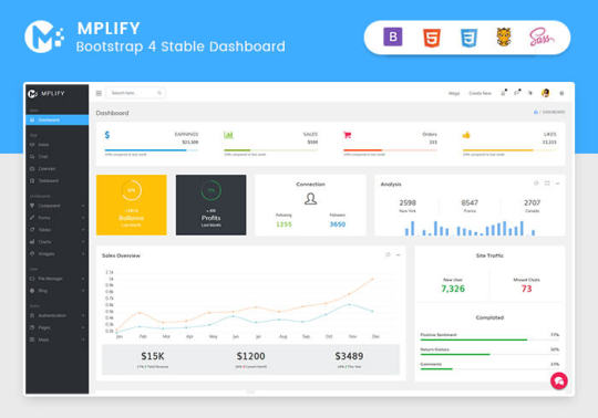
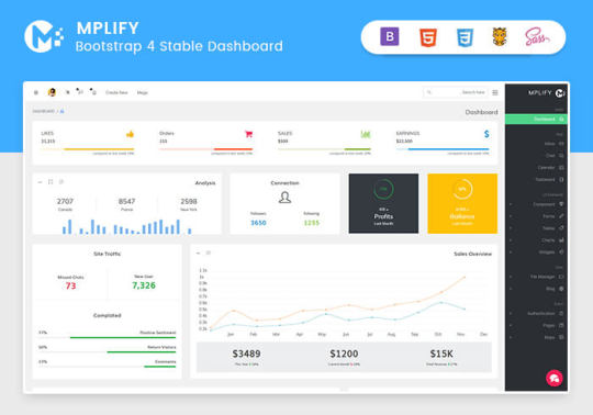
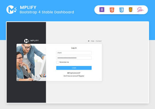
Mplify - Versatile Bootstrap 4 Admin Template by Thememakker
Mplify Admin makes the development process easy and fast for you and aims to help you implement your idea in real time.
Product Highlights
Mplify is a fully professional, responsive, modern, multi-purpose, and feature-rich admin template. It can be used to create various websites, admin templates, admin dashboards, backend websites, CMS, CRM, blogs, business websites, timelines, and portfolios. This versatility makes it an ideal choice for developers looking to build functional and aesthetically pleasing web applications efficiently.
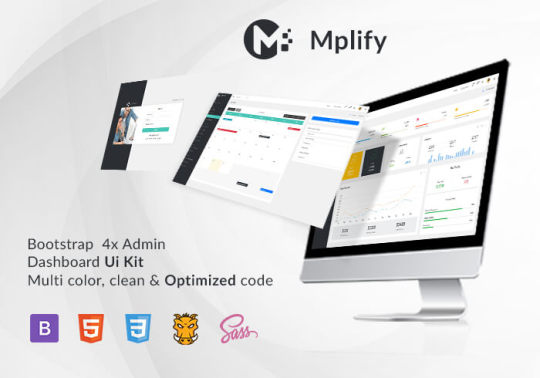
Key Features
Bootstrap 4.3.1: Ensures compatibility and modern design standards.
jQuery 3.3.1: Offers extensive plugins and support.
Built-in SCSS: Provides more flexibility and control over styles.
Light & Dark Full Support: Allows users to switch between light and dark themes.
RTL Full Support: Right-to-left language support for global accessibility.
W3C Validate Code: Ensures high coding standards and practices.
Mobile and Tablet Friendly: Responsive design for all devices.
Treeview: For hierarchical data display.
Drag & Drop Upload: Simplifies file uploading processes.
Image Cropping: Integrated tools for editing images.
Summernote: Rich text editor integration.
Markdown: Support for markdown formatting.
Beautiful Inbox Interface: User-friendly email management.
User-Friendly Chat App: Built-in chat application.
Scrum & Kanban Taskboard: Task management tools.
Add Events to Your Calendar: Event management capabilities.
File Manager: Efficient file organization and management.
Blogging: Tools to manage and create blog posts.
Testimonials: Features to showcase user testimonials.
Maintenance: Tools to manage and schedule maintenance.
Team Board: Collaboration tools for team management.
Search Result: Enhanced search functionalities.
Beautiful Pricing: Elegant pricing tables and plans.
Contact List & Grid: Efficient contact management.
User Profile: Customizable user profiles.
Extended Forms: Advanced form functionalities.
Clean Widgets: A variety of clean, modern widgets.
Technical Specifications
Bootstrap 4.3.1
Bootstrap 4.3.1 is a powerful front-end framework for faster and easier web development. It includes HTML and CSS-based design templates for typography, forms, buttons, tables, navigation, modals, image carousels, and many other interface components, as well as optional JavaScript plugins. Mplify leverages Bootstrap 4.3.1 to ensure a consistent and responsive design across all devices.
jQuery 3.3.1
jQuery is a fast, small, and feature-rich JavaScript library. It makes things like HTML document traversal and manipulation, event handling, and animation much simpler with an easy-to-use custom API integration that works across a multitude of browsers. Mplify includes jQuery 3.3.1 to provide enhanced functionality and interactivity to your applications.
Built-in SCSS
SCSS is a preprocessor scripting language that is interpreted or compiled into CSS. It allows you to use variables, nested rules, mixins, inline imports, and more, all with a fully CSS-compatible syntax. With SCSS, Mplify offers a more powerful and flexible way to manage styles.
Light & Dark Full Support
Mplify comes with built-in support for light and dark themes, allowing users to switch between these modes based on their preferences. This feature enhances user experience and accessibility, especially in different lighting conditions.
RTL Full Support
For developers targeting global audiences, Mplify provides full right-to-left (RTL) language support. This feature ensures that languages like Arabic, Hebrew, and Persian are properly displayed, making the template versatile and inclusive.
W3C Validate Code
The World Wide Web Consortium (W3C) sets the standards for web development. Mplify adheres to W3C's coding standards, ensuring that the template is built with clean, valid code, which improves browser compatibility, SEO, and overall performance.
Mobile and Tablet Friendly
In today's mobile-first world, having a responsive design is crucial. Mplify is designed to be fully responsive, ensuring that your mobile application looks great and functions seamlessly on all devices, including desktops, tablets, and smartphones.
Applications
Mplify’s versatile design and feature set make it suitable for a wide range of applications across various industries. Here are some key applications:
Admin Dashboards
Mplify provides a robust framework for building admin dashboards. With its extensive set of UI components, charts, forms, and tables, you can create comprehensive dashboards that provide valuable insights and data visualization.
CMS (Content Management Systems)
With features like blogging, file management, and user profile management, Mplify can be used to build powerful CMS platforms. Its clean widgets and beautiful interface ensure that the content management experience is both efficient and enjoyable.
CRM (Customer Relationship Management)
Mplify’s built-in tools for managing contacts, scheduling events, and maintaining communication through a chat app make it an excellent choice for developing CRM systems. These features help businesses manage customer interactions and data effectively.
Business Websites
The multi-purpose nature of Mplify allows it to be used for various business websites. Whether you need a portfolio, a blog, or a corporate website, Mplify provides the necessary tools and components to create a professional online presence.
Blogging Platforms
With integrated tools like Summernote for rich text editing and Markdown support, Mplify is ideal for creating blogging platforms. The beautiful inbox interface and testimonial features enhance the blogging experience, making it easy to manage and publish content.
Benefits
Easy and Fast Development
Mplify is designed to streamline the development process. With its pre-built components and templates, you can quickly assemble functional and aesthetically pleasing applications. This reduces development time and costs, allowing you to focus on implementing your ideas in real time.
Professional and Modern Design
Mplify offers a clean, modern design that is both professional and user-friendly. The template includes a variety of customizable widgets and components that adhere to the latest design standards, ensuring your application looks polished and up-to-date.
Comprehensive Feature Set
From task management tools like Scrum and Kanban boards to extensive form functionalities, Mplify provides a wide range of features that cater to various needs. This comprehensive feature set makes it a versatile solution for different types of projects.
Responsive and Mobile-Friendly
With Mplify, you can ensure that your application is accessible on all devices. Its responsive design adapts to different screen sizes, providing a seamless user experience on desktops, tablets, and smartphones.
Global Accessibility
Mplify’s RTL support and multi-language capabilities make it suitable for global applications. This feature ensures that your application can cater to users from different regions, enhancing its reach and usability.
Regular Updates and Support
When you purchase a license for Mplify, you receive all future updates for free. This ensures that your application remains up-to-date with the latest features and improvements. Additionally, Mplify provides excellent customer support to assist with any issues or queries.
Challenges and Limitations
Learning Curve
While Mplify is designed to be user-friendly, there may be a learning curve for beginners who are not familiar with Bootstrap or jQuery. However, comprehensive documentation and community support can help mitigate this challenge.
Customization
Although Mplify offers a wide range of customization options, extensive customization may require advanced knowledge of SCSS and JavaScript. This could be a limitation for developers who are not well-versed in these technologies.
Performance
As with any feature-rich template, there is a potential for performance issues if too many components and plugins are used simultaneously. It is important to optimize the application and selectively use features to maintain optimal performance.
Latest Innovations
Enhanced UI Components
Mplify continues to evolve with regular updates that introduce new and improved UI components. These enhancements ensure that your application remains modern and functional.
Advanced-Data Visualization
Recent updates have focused on improving data visualization capabilities. With enhanced charting tools and interactive elements, Mplify allows for more dynamic and engaging data presentation.
Integration with New Technologies
Mplify is continuously updated to integrate with the latest web technologies. This ensures compatibility with new frameworks and libraries, providing developers with more tools to build advanced applications.
Future Prospects
AI and Machine Learning Integration
The future of Mplify may include integration with AI and machine learning tools. This would enable developers to build more intelligent and automated applications, enhancing user experience and functionality.
Expanded Plugin Support
As the web development landscape evolves, Mplify is likely to expand its plugin support. This will provide developers with more options for extending the functionality of their applications.
Improved Accessibility Features
Mplify is expected to continue enhancing its accessibility features. This includes better support for assistive technologies and compliance with accessibility standards, ensuring that applications built with Mplify are inclusive for all users.
Comparative Analysis
Versus Other Bootstrap Templates
When compared to other Bootstrap templates, Mplify stands out due to its comprehensive feature set, modern design, and extensive customization options. While other templates may offer similar components, Mplify's unique features like RTL support and advanced task management tools give it an edge.
Versus Custom Development
Opting for a pre-built template like Mplify can significantly reduce development time and costs compared to custom web development. While custom development offers more flexibility, Mplify provides a robust foundation that can be easily customized to meet specific needs.
User Guides and Tutorials
Getting Started with Mplify
Installation: Download and install Mplify from the official website or marketplace.
Configuration: Configure the template settings according to your project requirements.
Customization: Use the built-in SCSS files to customize the styles and appearance.
Integration: Integrate Mplify with your backend systems and databases.
Deployment: Deploy your application on your preferred hosting platform.
Advanced Customization Techniques
SCSS Variables: Use SCSS variables to easily change colors, fonts, and other styles.
JavaScript Customization: Extend the functionality by adding custom JavaScript code.
Component Modification: Modify existing components or create new ones to meet specific needs.
Performance Optimization: Optimize the performance by minifying CSS and JavaScript files, and selectively loading components.
Conclusion
Mplify is a powerful, versatile, and user-friendly Bootstrap 4 admin dashboard template. It offers a wide range of features and customization options, making it suitable for various applications, from admin dashboards to business websites. With its modern design, responsive layout, and extensive documentation, Mplify simplifies the development process, allowing developers to implement their ideas in real time efficiently.
Whether you are building a CMS, CRM, or a personal blog, Mplify provides the tools and flexibility needed to create a professional and functional web application. Its ongoing updates and support ensure that your projects remain current and compatible with the latest web technologies.
#Mplify Admin#Bootstrap 4.3.1#jQuery 3.3.1#SCSS#Light & Dark Theme#RTL Support#W3C Validation#Responsive Design#Admin Template#Admin Dashboard#CMS#CRM#Blogging#Business Websites#Web Development#UI Components#Data Visualization#AI Integration#Machine Learning#Accessibility Features#Task Management#File Management#Rich Text Editor#Markdown Support#User Profiles#Performance Optimization#Web Technologies#Custom Development#Web Application Development#Front-end Framework
0 notes
Text
5 Udemy Paid Course for Free with Certification.(Limited Time for Enrollment)

1. HTML & CSS - Certification Course for Beginners
Learn the Foundations of HTML & CSS to Create Fully Customized, Mobile Responsive Web Pages
What you'll learn
The Structure of an HTML Page
Core HTML Tags
HTML Spacing
HTML Text Formatting & Decoration
HTML Lists (Ordered, Unordered)
HTML Image Insertion
HTML Embedding Videos
Absolute vs. Relative File Referencing
Link Creation, Anchor Tags, Tables
Table Background Images
Form Tags and Attributes - Buttons, Input Areas, Select Menus
Parts of a CSS Rule
CSS - Classes, Spans, Divisions
CSS Text Properties, Margins, & Padding
CSS Borders, Backgrounds, & Transparency
CSS Positioning - Relative, Absolute, Fixed, Float, Clear
CSS Z-Index, Styling Links, Tables
Responsive Web Page Design using CSS
Take This Course
👇👇👇👇👇👇👇
5 Udemy Paid Course for Free with Certification. (Limited Time for Enrollment)
2. Bootstrap & jQuery - Certification Course for Beginners
Learn to Create fully Animated, Interactive, Mobile Responsive Web Pages using Bootstrap & jQuery Library.
What you'll learn
How to create Mobile-Responsive web pages using the Bootstrap Grid System
How to create custom, drop-down navigation menus with animation
How to create collapse panels, accordion menus, pill menus and other types of UI elements
Working with Typography in Bootstrap for modern, stylish fonts
Working with Lists and Pagination to organize content
How to add events to page elements using jQuery
How to create animations in jQuery (Fade, Toggle, Slide, Animate, Hide-Show)
How to add and remove elements using Selectors (Id, Class)
How to use the Get Content function to retrieve Values and Attributes
How to use the jQuery Callback, and Chaining Function
Master the use of jQuery Animate with Multiple Params, Relative Values, and Queue Functionality
Take This Course
👇👇👇👇👇👇👇👇
5 Udemy Paid Course for Free with Certification.(Limited Time for Enrollment)
3. AWS Beginner to Intermediate: EC2, IAM, ELB, ASG, Route 53
AWS Accounts | Billing | IAM Admin | EC2 Config | Ubuntu | AWS Storage | EBS | EFS | AMI | Load Balancers | Route 53
What you'll learn
AWS Account Registration and Administration
Account Billing and Basic Security
AWS Identity and Access Management (IAM)
Creating IAM Users, Groups, Policies, and Roles
Deploying and Administering Amazon EC2 Instances
Creating Amazon Machine Images
Navigating the EC2 Instances Console
Working with Elastic IPs
Remote Instance Administration using Terminal and PuTTY
Exploring various AWS Storage Solutions (EBS, EFS)
Creating EBS Snapshots
Working with the EC2 Image Builder
Working with the Elastic File System (EFS)
Deploying Elastic Load Balancers (ELB)
Working with Auto Scaling Groups (ASG)
Dynamic Scaling using ELB + ASG
Creating Launch Templates
Configuring Hosted-Zones using Route 53
Take This Course
👇👇👇👇👇👇👇👇
5 Udemy Paid Course for Free with Certification.(Limited Time for Enrollment)
4. Google Analytics 4 (GA4) Certification. How to Pass the Exam
A Step-by-Step Guide to Passing the Google Analytics 4 (GA4) Certification Exam!
What you'll learn
Master key terms and concepts to effortlessly pass the Google Analytics 4 Certification Exam
Understand GA4 settings to optimize data flow to your site
Utilize the power of tags and events for effective data collection
Learn to track important metrics like events, conversions, LTV, etc. for operational decisions
Navigate GA4’s user-friendly interface to create and interpret impactful reports and analyses
Gain insider tips and sample questions to effortlessly pass the certification test
Take This Course
👇👇👇👇👇👇👇👇
5 Udemy Paid Course for Free with Certification.(Limited Time for Enrollment)
5. The Complete C & C++ Programming Course - Mastering C & C++
Complete C & C++ Programming Course basic to advanced
What you'll learn
Fundamentals of Programming
No outdated C++ Coding Style
Loops - while, do-while, for
The right way to code in C++
Gain confidence in C++ memory management
Take This Course
👇👇👇👇👇👇👇👇
5 Udemy Paid Course for Free with Certification.(Limited Time for Enrollment)
0 notes
Photo

🚀10 webs para resolver todas tus preguntas de programación.⠀ ✅Cuando aprendemos a programar o desarrollar software, sitios web o aplicaciones, por lo general tenemos preguntas de programación, nos quedamos atascados con un problema o un error que se niega a resolverse, sin importar lo que hagas.⠀ ⠀ En casos como este, los programadores como tu pueden necesitar respuestas a preguntas de programación relacionadas con varios lenguajes, plataformas de desarrollo , herramientas, API y servicios. ¿Dónde puedes encontrar las soluciones que necesitas a tus preguntas de programación?⠀ ⠀ Tuve el mismo pensamiento y después de hacer todo el trabajo de campo, aquí están las 10 mejores comunidades llenas de personas brillantes que pueden tener las respuestas que estás buscando o consejos que pueden ser útiles para ayudarte a encontrar la solución a tus preguntas de programación.⠀ 👉Nuevo post en mi blog, link en mi bio.⠀ 📣 #bootstrap #template #html #theme #css #admin #startup #wordpress #grid #blog #bootstraptemplate #working #design #webdesign #bootstrapadmin #admintemplate #blogtheme #jquery #read #php #framework #free #business #pages #moderndesign #code #brand #entrepreneur #website https://www.instagram.com/p/CUFGK-ctBvB/?utm_medium=tumblr
#bootstrap#template#html#theme#css#admin#startup#wordpress#grid#blog#bootstraptemplate#working#design#webdesign#bootstrapadmin#admintemplate#blogtheme#jquery#read#php#framework#free#business#pages#moderndesign#code#brand#entrepreneur#website
0 notes
Text
Scss prepros comments stay in compressed

SCSS PREPROS COMMENTS STAY IN COMPRESSED FULL
SCSS PREPROS COMMENTS STAY IN COMPRESSED CODE
SCSS PREPROS COMMENTS STAY IN COMPRESSED FREE
SCSS PREPROS COMMENTS STAY IN COMPRESSED WINDOWS
Web Colour Data is a web service to easily find out “which colors are used on a web page”. This is also the engine behind GitHub Pages, which you can use to host your project’s page or blog right here from GitHub. It takes a template directory (representing the raw form of a website), runs it through Textile or Markdown and Liquid converters, and spits out a complete, static website suitable for serving with Apache or your favorite web server. Jekyll is a simple, blog aware, static site generator. There is no server-side components, no build process needed. Essentially, it’s the easiest way to make open source documentation from Readme files.
SCSS PREPROS COMMENTS STAY IN COMPRESSED FULL
It is a small JavaScript file that fetches Markdown files and renders them as full pages. ICEcoder has a powerful JavaScript API for easily interacting with it and it works with many popular languages (PHP, JS, CSS, LESS, Ruby, etc.).įlatdoc is the fastest way to create a site for your open source project. There is support for Emmet and comes bundled with Adminer (for managing MySQL).
SCSS PREPROS COMMENTS STAY IN COMPRESSED CODE
The syntax of the code is highlighted, broken tags and HTML structure are displayed + allows selecting them easily. It works by simply dropping its app folder to anywhere we prefer and any files there (and inside subfolders) are ready to be edited. ICEcoder is an open source and web-based IDE that is built with PHP and works fast. ICE Coder : PHP Powered and Open Source Web IDE It has support for multiple caching methods (apc, memcache, memcached, wincache, files, pdo and mpdo), the period of caching can be defined and has a very simplified API.ĩ. PhpFastCache is an open source PHP caching library that comes as asingle-file and can be integrated so quickly. JSONmate has support for JSONP too and it is an open source project. Also, it has a very nice visual editor for customizing the data and a visualizer that provides a different view for it. JSONmate is a web app that can beautify (and uglify) JSON strings where these strings can be directly pasted or loaded from a remote URL. There are options for the compiling process like the output format or its style (compressed, nested.).ħ. It auto-compiles the source and injects the CSS (also HTML and JS) to the browser so that no refresh is needed.
SCSS PREPROS COMMENTS STAY IN COMPRESSED WINDOWS
Prepros is an open source application for Windows OS that can do that automatically for Less, Sass, Scss, Stylus, Jade, Coffeescript, Haml and Markdown. Markup used is very simple and the whole framework is pretty lightweight(5.7KB minified and gzipped). The framework is built with responsive layouts in mind and has styles fortypography, grids, forms, buttons, tables and navigation. It uses Normalize.CSS anddoesn’t use any JavaScript but only HTML-CSS. Pure is a fresh one that is created by Yahoo!. Pingendo has built-in support for Bootstrap + Foundation frameworks an Font Awesome (more such stuff will be added). There is a DOM-tree editor which we can quickly view the tree and edit their styles and/or properties.
SCSS PREPROS COMMENTS STAY IN COMPRESSED FREE
It is currently free (can become paid after the beta – no info on that) and focuses on easing web authoring. Pingendo is a fresh IDE that is currently in beta status and available for Win + Mac. Pingendo : An IDE for Front-End Frameworks Products can have different tax rates, many shipping methods are supported and it is integrated with Omnipay (multi-gateway payment processing library).Ĥ. It is capable of managing stores of any size and having complex products + categories. Sylius is an open source and free e-commerce solution for PHP (and based on Symfony2). Sylius : Open Source PHP E-Commerce Solution Also, the website has an encode and decoder for converting any text.ģ. Characters can be sorted as categories and a search exists for locating them easily. Unicode-Table is a website providing a great unicode character table that lists unicode numbers and HTML codes of any character. Unicode- Table : Website for Unicode Characters Contact requests can be accepted/declined, statuses can be set (online, away.) and there are “typing” notifications to inform the “listening” users. It sits in the footer of web pages just like Facebook-chat and has support for one-to-one or multi-user conversations. Converse.js : Open Source & Facebook Like Chat ClientsĬonverse.js is an open source chat application that can connect to any XMPP/Jabber server (like Google Talk,Skype, etc.). We hope that these tools will make your work flow smoother and allow you to save some time in doing the things that matter. Below, we have listed some useful and fresh tools for web developers and designers.
0 notes
Text
Bootstrap Admin Web App Template Dashboard – Fab

Fab Bootstrap Admin Web App Template is a fully responsive admin dashboard template for job analytical data. You can track and analyze your job statistics from our HTML template plugins and widgets. Modern-looking HTML Template on Bootstrap 4 Stable platform.
Fab Bootstrap Admin Template comes with UI Kit in Badges, Buttons, Floating Action Buttons, Carousel, Modal, Dropdown, Dropdown menu, Sortable, Nav, Breadcrumbs, Pagination, Alert, Callout, Tooltip, Accordion, Tab, Process, Progress bar, Spinner, Timeline, Timeline activity, User Cards, Sweet Alert, Notification, Advanced Media, Badges, Dropdown grid, Dropdown menu, Dropdown, border, color, Draggable Portlet, Bootstrap Switch, Date Paginator, Horizontal Timeline, Nestable, Ribbons.
MORE INFO / BUY NOW DEMO
Like Us


#Bootstrap Templates#Bootstrap UI Kit#Premium Admin Template#premium admin templates#Premium Admin Templates responsive#premium bootstrap templates#product design#Bootstrap 5Admin Templates#Bootstrap Admin Dashboard#Bootstrap Admin HTML#Bootstrap Admin Template#Bootstrap Admin Templates#bootstrap admin theme#Bootstrap Admin Web App#dashboard html clean responsive template#dashboard html template#dashboard template#Admin Dashboard responsive template#admin dashboard template#admin dashboard templates#admin dashboard ui#Admin Dashboard UI Kit#admin panel#admin panel admin dashboard#admin template#admin templates#Admin Templates Bootstrap#Bootstrap Admin Web App Template Dashboard#web app#web application design
0 notes
Text
Material Dashboard Pro React
Live Preview
Freebiesfrom Creative Tim
Favorite Themes

Landing Zero Theme A free landing page theme with video background
New in Bootstrap 4 Theme Bootstrap 4 one page example of what's new
Bootstrap 4 Admin Dashboard Bootstrap 4 admin starter theme
Lattes Lattes is a multipurpose theme with modern and clean elements, using plenty of white space to put most of the focus on your content. Lattes boasts a fully responsive design, clean HTML markup, bootstrap framework, portfolio grid and an amazing responsive navigation.
Rage Rage is a creative and fresh-look Multipurpose template made for Creative, Portfolio, Business website. Rage is a clean Multipurpose template with design features specifically for Creative site.
Parallax One A stunning, responsive Free One Page WordPress theme excellent for Creative Individuals!
Mobirise - Free One Page Bootstrap Template A free and fully responsive, mobile optimized bootstrap template by Mobirise
Cardio One Page Template One page free Bootstrap theme
More

Live Preview

Freebiesfrom Creative Tim
React Charts - Bootstrap 4 & Material Design. React Bootstrap charts are graphical representations of data. Charts come in different sizes and shapes: bar, line, pie, radar, polar and more. At your disposal are 6 types of charts and multiple options for customization. Material Dashboard PRO React is a Premium Material-UI Admin created using create-react-app with a fresh, new design inspired by Google's Material Design. The product comes with a simple JWT authentication flow: login/register/logout powered by a Node JS API Server (PRO version).
0 notes
Text
Bootstrap Admin Template – Developing Complex Progressive Web App
Bootstrap Admin Template have become an integral part of web applications and websites. Whether for managing content, monitoring performance, or tracking business metrics, admin templates provide an organized way to interact with complex data. One of the most popular frameworks for developing admin dashboards is Bootstrap, an open-source front-end framework. Its flexibility, scalability, and ease of use have made it a go-to choice for developers.
Our Bootstrap Admin Template comes with a powerful set of features, including seven analytics dashboards and three CRM dashboards, all built with the latest Bootstrap 5 framework. In this article, we will delve into the importance of Bootstrap admin templates, explore the benefits of our master dashboard, discuss the web development process with our Bootstrap admin template, and explain why we stand out in the competitive market.
1. Importance of Bootstrap Admin Template
Admin templates serve as the backbone of modern web applications, providing users with a structured and functional interface to interact with data. In any web application, especially those dealing with large amounts of information or business operations, managing the backend is just as crucial as the frontend. Here's why a Bootstrap Admin Template is important:
a. Consistency and Efficiency
Bootstrap provides a consistent design system that ensures your Master Dashboard looks polished and professional across all devices. The admin template built on Bootstrap follows this system, which results in a responsive layout, intuitive user interface, and easy-to-use components. By leveraging Bootstrap, you avoid having to create these elements from scratch.
b. Time-Saving
For web developers, time is a precious resource. A pre-built Bootstrap Admin Template like ours saves a significant amount of time during the development process. Instead of building every feature from the ground up, developers can use the template’s pre-built features, like navigation menus, charts, and tables, which speeds up development without compromising on quality.
c. Mobile Responsiveness
In today’s mobile-first world, ensuring that your admin panel works flawlessly on mobile devices is crucial. Bootstrap’s grid system allows developers to create responsive layouts with minimal effort, ensuring your dashboard will look great on screens of all sizes—whether it’s a desktop, tablet, or smartphone.
d. Customization Flexibility
While WebApp Template come with a set of predefined elements, they also offer ample room for customization. Developers can easily modify or extend the templates to meet the specific needs of their project. From changing the color scheme to adding new widgets, Bootstrap admin templates allow easy modification to align with the brand’s identity.
e. Built-In Components and Widgets
Bootstrap is known for its comprehensive library of UI components. From buttons and cards to forms and modals, everything you need to create an admin dashboard is available. Bootstrap 5 offers enhanced features like improved grid layouts, native custom form controls, and additional utilities, all of which help in developing complex admin dashboards.
2. Benefits of Our Master Dashboard
Our Master Dashboard, built with the latest Bootstrap 5 framework, offers a comprehensive solution for managing and monitoring all aspects of your application or business. It is packed with features to ensure an efficient and productive experience for both administrators and end-users. Here are some of the key benefits:
a. Comprehensive Analytics Dashboards
Our dashboard offers seven analytics UI Dashboard, each tailored for specific use cases. Whether you’re tracking user engagement, sales data, traffic patterns, or marketing performance, these dashboards are designed to give you valuable insights at a glance.
Real-Time Data: The analytics dashboards provide real-time data, allowing you to make informed decisions quickly.
Advanced Charts and Graphs: With rich charts, graphs, and tables, the dashboard transforms raw data into digestible, visual representations.
Customizable Widgets: You can add, remove, or customize widgets to suit your specific needs.
b. CRM Dashboards for Customer Relationship Management
Our three CRM dashboards are designed to help businesses track and improve their customer relationships. The dashboards offer valuable insights that assist in managing leads, tracking sales pipelines, and improving customer satisfaction.
Lead Management: Easily track the status of leads and opportunities with detailed reports and timelines.
Customer Interactions: Monitor customer interactions, allowing your team to provide more personalized service.
Task and Activity Tracking: Keep an eye on sales activities, ensuring that important tasks are completed on time.
c. User-Friendly Interface
One of the core principles of our Dashboard UI is its user-friendly interface. Thanks to Bootstrap 5’s sleek and intuitive design, the dashboard is easy to navigate, even for non-technical users. The layout is structured logically, allowing users to access the information they need without confusion.
d. Customization and Scalability
Our Master Dashboard is not just functional but also highly customizable. You can change the design, add new features, or tweak existing ones to better fit your business requirements. Whether you need to add a new widget or adjust the layout for specific devices, the template allows easy modifications. Plus, the modular structure of the dashboard makes it scalable, meaning it can grow as your business or application does.
e. Optimized Performance
Our Admin Dashboard UI is optimized for performance. It’s lightweight, ensuring fast loading times, even when dealing with large datasets. Bootstrap’s modular design helps ensure that only necessary resources are loaded, keeping the page load time to a minimum.
3. Web Development Process with Our Bootstrap Admin Template
The web development process can be complex, especially when building an admin dashboard that requires features like analytics, CRM tools, and real-time data tracking. Our Bootstrap Admin Template simplifies this process and makes it more efficient.
a. Step 1: Planning and Requirement Gathering
The first step is to clearly define the project’s goals and understand the requirements. This involves determining the key metrics you want to track, understanding user roles (admin, manager, user), and identifying the features you need, such as the analytics dashboards, CRM tools, or data visualizations.
b. Step 2: Designing the User Interface
Once the requirements are set, the next step is designing the user interface. The UI design ensures the user experience (UX) is smooth and intuitive. Thanks to Bootstrap 5, developers have access to a modern, responsive grid system that adapts to any device, ensuring a seamless experience across desktops, tablets, and smartphones.
Our template provides pre-designed pages, including dashboards, login screens, and user management, allowing you to build a professional-looking admin panel without the hassle of custom design.
c. Step 3: Setting Up the Template
After the design phase, the next step is integrating the Bootstrap Admin Template into the project. This is where the real development begins. You can begin customizing the provided template, adding your desired components, and incorporating data into the analytics and CRM dashboards.
Our Admin Dashboard UI includes built-in components like charts, tables, forms, and modals, which can be configured to fetch data dynamically and be used in the backend of your web application. The template also includes pre-configured JavaScript and jQuery components for handling events and interactions.
d. Step 4: Data Integration
Once the design and layout are ready, the next step is integrating the data. Whether you are pulling data from a database or external API, you can configure the dashboard to fetch and display data dynamically. The analytics and CRM dashboards will be connected to your backend systems, allowing the data to update in real-time.
e. Step 5: Testing and Optimization
Testing is a critical part of the development process. Our Bootstrap Admin Template is built with cross-browser compatibility in mind, so it works seamlessly on different browsers (Chrome, Firefox, Safari, etc.). You can test the template on various screen sizes and devices to ensure its responsiveness.
Performance testing is another crucial aspect. The template is optimized to handle large datasets without compromising speed or performance. Developers can use tools like Google Page Speed Insights or Lighthouse to test and improve performance.
f. Step 6: Deployment and Maintenance
Once everything is in place and tested, it’s time to deploy the application to a live environment. Our Bootstrap Admin Template ensures that deployment is smooth, whether you’re using shared hosting, VPS, or cloud services. Post-launch, you can continue to make updates and improvements as needed, thanks to the template’s scalability.
4. Why We Are Better?
In a competitive market filled with various Bootstrap admin templates, what makes our Bootstrap Admin Panel stand out? Here are a few reasons why we are the best choice for your project:
a. Built with Latest Bootstrap 5
We’ve used the latest version of Bootstrap (Bootstrap 5), which comes with new features like custom form controls, enhanced grid systems, and improved utilities. This ensures the template is future-proof and delivers an outstanding user experience.
b. Fully Responsive and Customizable
Our Dashboard Template is fully responsive and adaptable to any screen size, providing a seamless experience on desktop, tablet, and mobile devices. Plus, it’s highly customizable, allowing you to tailor it to your specific business needs.
c. Pre-Built Dashboards
We’ve included seven powerful analytics dashboards and three CRM dashboards, offering a comprehensive suite of tools to help businesses track performance and customer data effectively. The dashboards are easy to use and packed with features to boost productivity.
d. Optimized for Performance
Our Bootstrap Admin Theme is optimized for high performance, ensuring quick load times even with large datasets. This makes it suitable for high-traffic web applications and enterprise solutions.
e. Detailed Documentation and Support
We provide detailed documentation, ensuring that developers can easily understand how to use and customize the template. Plus, our dedicated support team is always ready to assist you with any questions or issues you may have.
5. Contact Us
If you are looking for a high-quality Bootstrap Admin Template to power your web application, look no further. Our master dashboard comes packed with all the features you need, from analytics tools to CRM dashboards, all built on the latest Bootstrap 5 framework.
#admin dashboard ui#Bootstrap Admin Panel#Dashboard UI#Bootstrap Admin Template#UI Dashboard#Master Dashboard
0 notes
Text
Simple Guidance For You In Web Design.
What is a Responsive Template? A responsive WordPress theme is one that adapts to different screen sizes. Zoom in and click on the content to see it on different devices. A website that looks great on a desktop device will look equally good on a mobile device. This theme can be customized with custom widgets and has many configuration options. It's responsive and makes the website look better. Responsive WordPress themes can be configured to work with any screen size. This theme is available from the Shopify theme marketplace and can be accessed in the admin panel immediately. The theme comes with a variety of built-in styles, so you can choose from one to start your website. You can also choose from any style. After selecting the Responsive theme you can add it to your Online Store. A Responsive themes are flexible. The Responsive Theme is grid-based, so you can access the home page on any device. You can customize your logo and it has multiple sections. The navigation menu is easy to use. You can personalize your theme to match your company and how your customers view your content. A responsive theme is ideal for creative artists. Bootstrap is used to build the Biography theme. It includes four layouts, as well as contact forms. There is also a timeline section. It's responsive and includes a slider, eight widget areas and a prominent slider. This multi-column theme works well for personal blogs and restaurants as well as other industries. The biography theme is available in a range of layouts and has the responsive design functionality. Foodica is a responsive WordPress theme. It is completely free. It's a good choice for food bloggers and magazines websites. It has icons to share social media and a featured content slide. Vega has an upgraded version with WooCommerce support. It is a drag-and-drop page creator. Both themes are responsive, and both allow for customization. WP-Tweet provides a large selection of responsive and free WordPress themes. The Essence is a white theme that's great for food-related magazines and websites. You can choose from a range of featured content sliders or carousel sliders. These themes are one of the most responsive WordPress themes. They are trendy and allow for many customization options. They are simple to use, look great on all devices. Corner is a customizable and flexible theme that can be modified and customized. Corner's two-column layout makes this theme ideal for all types of websites. You can even add your own logo. It is easy to customize, and includes a built-in navigation bar. It features many sections including a slider to show the most popular content. This theme is perfect for portfolio websites. These themes are ideal for both small and large businesses. WP-Responsive, one of the most popular themes on Shopify is highly recommended. It is flexible and has many options. It can be used on all devices. This theme will enhance the beauty of your site. The responsive theme will increase your website's search engine optimization. This theme is one of the most requested Shopify themes. Bordeaux is a responsive WordPress template that can be used for both hotels and other hospitality websites. It features a simple, elegant design. The Ajax cart allows for a fluid experience. It is simple to use and has multiple templates. Felt's layout is three columns. Thanks to the header image, and full screen slider image slider, it is easy to see. This theme is ideal for podcasts and mobile-responsive. The Traveler is an easy-to-install theme that offers 50 homepage layout options. It is compatible with Bootstrap 4 as well as Gutenberg. It comes with a filtered background and mixed white/coloured content blocks. Crocal can be used with a variety plugins. The Traveler Theme as well as the Genesis Theme are compatible, aside from the two main features already mentioned. You can also find a lot of other users.
0 notes
Text
10 Struggles Only People In Website Building Industry Will Understand.
What is a Responsive Theme? A Responsive theme is a WordPress theme that adjusts to various screen sizes. You can zoom in and click on the same content to view it on various devices. A website that looks amazing on a desktop is equally attractive on mobile devices. This kind of theme allows for a variety of configuration options including custom widgets. It's mobile-friendly and improves the website's appearance. A Responsive Theme is a WordPress theme made to be compatible with any screen size. It is available on the Shopify theme marketplace, and it is immediately accessible in the admin panel. This theme includes built-in styles and you can pick one of them as the starting point for your website. You can also select any style to start from. After you've chosen the Responsive theme, it'll be added to your Online Store section. Another benefit of a Responsive Theme is that it is flexible. The grid-based layout of the Responsive Theme enables you to access the home page from any device. It comes with multiple sections and a customizable logo. The navigation menu is simple to use and simple. You can customize your theme to suit your company and the way that your customers browse your content. If you're a creative artist you can pick an responsive theme that's right for your needs. The Biography theme is built on the Bootstrap framework. It comes with four layouts that have been designed and contact forms. It also has a timeline section. It's fully responsive, and has a prominent slider as well as eight widget areas. This multi-column theme is great for personal blogs, restaurants, or other industries. The biography theme has a variety of layouts, and comes with the functionality of a responsive design. Foodica is a different responsive WordPress theme that is free. It's an ideal choice for food bloggers and magazines websites. It includes a featured content slider and icons for sharing social media. Vega comes with an upgraded version that includes WooCommerce support in full. It's a simple drag-and-drop page builder. Both themes are responsive and provide several options for customization. WP-Tweet has a great selection of responsive, free WordPress themes. The Essence has a white background and is perfect for food-related websites and magazines. The theme comes with a variety of featured content sliders and carousel sliders. These themes are among the most responsive WordPress themes. They are stylish and offer many options for customization. They're simple to use and look great on any device. Corner is a flexible and customizable theme that can be adapted and customized. Its two-column layout makes it ideal for all kinds of websites. It also lets you include a custom logo. It is simple to customize and comes with a built in navigation menu. It has many sections on the homepage, including a slider that shows the most popular content. This theme is great for portfolio websites. These themes are great for both large and small businesses. WP-Responsive is one of the most highly reviewed themes on Shopify. It's flexible and offers a wide range of options. It works with all devices. This theme will make your site appear stunning. A responsive theme will boost your website's SEO. With all these features, it's one of the most popular Shopify themes. Bordeaux is a responsive WordPress theme which can be used for hotels as well as other hospitality websites. It has a clean and elegant design. It has an Ajax cart that allows for a fluid experience. It is easy to use and comes with multiple templates for pages. Felt has a beautiful three column layout. It is easy to read due to a header image and a full screen image slider. The theme is mobile-responsive and ideal for podcasts. The Traveler is a one-click install theme with fifty homepage layout options. It comes with Bootstrap 4 and supports Gutenberg. It features a filtered background image as well as a mixture of white and coloured content blocks. Crocal supports a variety of plugins in addition to its flexible design. Apart from the two main features that are mentioned above, the Traveler and Genesis Theme are both compatible with each other. It also has a large community of users.
0 notes
Text
The Story Of Website Building Has Just Gone Viral!
What is a Responsive theme? A responsive theme is a WordPress theme which adjusts to different screen sizes. To view the same content on different devices, you can zoom in on it and click on it again. Websites that look great on desktop devices will also look good on mobile devices. This theme is flexible and can be configured with custom widgets. It is mobile-friendly, and enhances the website's appearance. Responsive themes are WordPress themes that can be used on any screen size. The theme is instantly accessible from the admin panel and is available in the Shopify theme marketplace. You can choose one of the built-in styles to be your site's starting point. You can choose any style you like to use as your starting point. Once you have chosen the Responsive theme it will be added to your Online Store section. A Responsive theme is also flexible. The Responsive Theme's grid-based layout allows you to access your home page from any device. The Responsive Theme comes with several sections and a customizable logo. It is easy to use and simple to navigate. Your theme can be customized to fit your company and your customers' browsing habits. You can choose a responsive theme for artists who are creative. Bootstrap is the framework that powers the Biography theme. There are four layouts and contact forms included. You can also find a timeline section. It is fully responsive and features a prominent slider, eight widget areas, as well as a fully responsive layout. This theme is perfect for personal blogs, restaurants and other industries. You can choose from a variety layouts for the biography theme, as well as responsive functionality. Foodica is a free responsive WordPress theme. It is a great choice for food bloggers as well as magazines websites. It features a featured content slider as well as icons for sharing social media. Vega also comes with an upgrade version that supports WooCommerce in full. This page builder is easy to use. Both themes are responsive and offer many customization options. WP-Tweet offers a wide range of free responsive WordPress themes. The Essence theme has a white background, which is ideal for magazines and websites that are food-related. There are many featured content sliders and carousel slideshows included in the theme. These themes are responsive WordPress themes. These themes are elegant and can be customized in many ways. They are easy to use and look fantastic on any device. Corner is a flexible, customizable theme that can easily be customized. The two-column layout is ideal for any type of website. You can also add your logo. It's easy to customize and has a built-in navigation menu. The homepage has several sections, including a slider showing the most popular content. This theme is ideal for portfolio websites. These themes work well for small and large businesses. WP-Responsive has been a highly-reviewed theme on Shopify. It is flexible and provides many options. It is compatible with all devices. This theme will make your website look amazing. Responsive themes will improve your website's SEO. It's one the most loved Shopify themes. Bordeaux is a responsive WordPress theme that can be used to create websites for hotels and other hospitality sites. It is simple and elegant in design. It features an Ajax cart which allows for fluid experiences. It's easy to use, and includes multiple templates for pages. Felt features a three-column layout. The header image and full-screen slider make it easy to read. It is responsive to mobile devices and perfect for podcasts. The Traveler theme is easy to install and offers fifty layout options. It supports Gutenberg and Bootstrap 4. It has a filter background image and can be mixed with white or coloured content blocks. Crocal is flexible enough to support a wide range of plugins. The Traveler Theme and Genesis Theme can be used together, in addition to the main features mentioned. There is also a large user base.
0 notes
Text
Five Top Reasons Why You Face Obstacles In Learning Website Building.
What is a Responsive Template? A responsive WordPress theme is one that adapts to different screen sizes. Zoom in and click on the content to see it on different devices. A website that looks great on a desktop device will look equally good on a mobile device. This theme can be customized with custom widgets and has many configuration options. It's responsive and makes the website look better. Responsive WordPress themes can be configured to work with any screen size. This theme is available from the Shopify theme marketplace and can be accessed in the admin panel immediately. The theme comes with a variety of built-in styles, so you can choose from one to start your website. You can also choose from any style. After selecting the Responsive theme you can add it to your Online Store. A Responsive themes are flexible. The Responsive Theme is grid-based, so you can access the home page on any device. You can customize your logo and it has multiple sections. The navigation menu is easy to use. You can personalize your theme to match your company and how your customers view your content. A responsive theme is ideal for creative artists. Bootstrap is used to build the Biography theme. It includes four layouts, as well as contact forms. There is also a timeline section. It's responsive and includes a slider, eight widget areas and a prominent slider. This multi-column theme works well for personal blogs and restaurants as well as other industries. The biography theme is available in a range of layouts and has the responsive design functionality. Foodica is a responsive WordPress theme. It is completely free. It's a good choice for food bloggers and magazines websites. It has icons to share social media and a featured content slide. Vega has an upgraded version with WooCommerce support. It is a drag-and-drop page creator. Both themes are responsive, and both allow for customization. WP-Tweet provides a large selection of responsive and free WordPress themes. The Essence is a white theme that's great for food-related magazines and websites. You can choose from a range of featured content sliders or carousel sliders. These themes are one of the most responsive WordPress themes. They are trendy and allow for many customization options. They are simple to use, look great on all devices. Corner is a customizable and flexible theme that can be modified and customized. Corner's two-column layout makes this theme ideal for all types of websites. You can even add your own logo. It is easy to customize, and includes a built-in navigation bar. It features many sections including a slider to show the most popular content. This theme is perfect for portfolio websites. These themes are ideal for both small and large businesses. WP-Responsive, one of the most popular themes on Shopify is highly recommended. It is flexible and has many options. It can be used on all devices. This theme will enhance the beauty of your site. The responsive theme will increase your website's search engine optimization. This theme is one of the most requested Shopify themes. Bordeaux is a responsive WordPress template that can be used for both hotels and other hospitality websites. It features a simple, elegant design. The Ajax cart allows for a fluid experience. It is simple to use and has multiple templates. Felt's layout is three columns. Thanks to the header image, and full screen slider image slider, it is easy to see. This theme is ideal for podcasts and mobile-responsive. The Traveler is an easy-to-install theme that offers 50 homepage layout options. It is compatible with Bootstrap 4 as well as Gutenberg. It comes with a filtered background and mixed white/coloured content blocks. Crocal can be used with a variety plugins. The Traveler Theme as well as the Genesis Theme are compatible, aside from the two main features already mentioned. You can also find a lot of other users.
0 notes
Photo

🚀Bootstrap 5 ¿Qué hay de nuevo y qué ha cambiado?⠀ ✅El equipo detrás del framework CSS más popular Bootstrap ha lanzado una nueva versión. Al momento de escribir este artículo, la versión estable de Bootstrap 5 está disponible ( versiones ) y está disponible para su uso. Veamos cuáles son estas nuevas características introducidas en Bootstrap 5 y cuáles son las diferencias en Bootstrap 4 vs Bootstrap 5.⠀ ⠀ Si bien hay muchos cambios bajo el capó, como un nuevo logotipo para Bootstrap, pase a Hugo de Jekyll, primero tocaremos esos aspectos que afectan más a los proyectos de desarrollo web.⠀ 👉Nuevo post, para verlo pincha en la en mi bio.⠀ 📣#bootstrap #template #html #theme #css #admin #startup #wordpress #grid #blog #bootstraptemplate #working #design #webdesign #bootstrapadmin #admintemplate #blogtheme #jquery #read #php #framework #free #business #pages #moderndesign #code #brand #entrepreneur #website https://www.instagram.com/p/CUC4vnDF0BX/?utm_medium=tumblr
#bootstrap#template#html#theme#css#admin#startup#wordpress#grid#blog#bootstraptemplate#working#design#webdesign#bootstrapadmin#admintemplate#blogtheme#jquery#read#php#framework#free#business#pages#moderndesign#code#brand#entrepreneur#website
0 notes
Text
This Is How Website Building Will Look Like In 10 Years Time.
What is a Responsive Topic? Responsive themes allow you to adjust the theme for different screen sizes. To view the same content across different devices, you can zoom out and click on it. A website that looks fantastic on a desktop computer will also look great on mobile. This theme has many configuration options and custom widgets. It's easy to use on mobile devices and enhances your website's appearance. A Responsive WordPress theme is one that works with all screen sizes. It is easily accessible via the admin panel. This theme is available in a number of styles that you can choose to be the starting point of your website. Any style can be used as a starting point. After selecting the Responsive design, it will be added into your Online Store. A Responsive Template is also flexible. The Responsive Theme has a grid-based layout that allows you access the home page from any device. It includes multiple sections as well as a custom logo. The navigation menu is simple and easy to use. You can personalize the theme to suit your business and the way your customers access your content. If you're an artist, you can choose a responsive theme that fits your needs. Bootstrap was used to create the Biography theme. There are four layouts available and contact information. It also features a timeline section. It's fully responsive with a prominent slider and eight widget area. This theme is ideal for personal blogs, restaurants, and other industries. The biography theme can be set up in several layouts and is responsive. Foodica is another responsive WordPress theme and is completely free. It's ideal for food bloggers, magazines websites, and other web designers. It comes with icons to share social networks and a featured slider. Vega's upgraded version includes WooCommerce support. This is a drag and drop page builder. Both themes are responsive with many customization options. WP Twitter offers many free, responsive WordPress themes. The Essence features a white background which makes it ideal for magazines and websites relating to food. This theme has a variety feature sliders and carousel sliders. These themes are some of the most responsive WordPress themes. They are fashionable and provide many customization options. They're easy to use and look amazing on any device. Corner is an adaptable and customizable theme which can be customized. Its two-column layout allows it to be used on all types of websites. You can add your logo. It is easy to customize and features a built in navigation. It offers many sections to the homepage, including an interactive slider that highlights the most frequently used content. This theme works well for portfolio websites. These themes are perfect for small and large companies. WP Responsive ranks high on Shopify. It's flexible and comes with many options. It works on all devices. This theme will make any site look beautiful. A responsive theme will help increase the SEO of your site. It is one of Shopify's most popular themes. Bordeaux is a responsive WordPress topic that can be used on hotels as well as other hospitality websites. It has an elegant and clean design. It uses an Ajax cart to provide a fluid experience. It's simple to use and comes standard with several templates. Felt uses a three column layout. Because of the header image and fullscreen image slider, it's easy for users to read. The theme is optimized for podcasts, and it's mobile-responsive. The Traveler theme can be installed in just one click and has fifty layout options. It includes Bootstrap 4 and Gutenberg support. It includes a filtered background picture and a mix of white-coloured content blocks. Crocal supports a wide variety of plugins, in addition to its flexible design. The Traveler Theme is compatible with the Genesis Theme. It is also supported by a large number of users.
0 notes
Text
Ten Lessons That Will Teach You All You Need To Know About Web Design.
What is Responsive Design? Responsive themes are WordPress themes that adjust to different screen sizes. To view the same content on multiple devices, zoom in and click again. A website that looks stunning on a desktop will be equally appealing on mobile devices. This theme offers a wide range of configuration options, including custom widgets. It's mobile-friendly which improves the site's appearance. A Responsive theme is a WordPress theme that adapts to any screen size. It can be found on the Shopify theme market and is immediately available in the admin area. This theme has built-in styling options. You can choose to use one of these styles as your starting point. You can also choose any style as your starting point. After you choose the Responsive template, it will be added in your Online Store section. Another advantage of Responsive Themes is its flexibility. The Responsive Theme allows you to access the homepage from any device thanks to its grid-based layout. It has several sections and can be customized with a logo. The navigation menus are easy to use. You can modify your theme to make it more relevant to your company or the way your customers use your content. You can choose the responsive theme that suits your needs if you are a creative artist. Bootstrap is the foundation of the Biography theme. It has four layouts as well contact forms. It also includes a timeline section. It is responsive, has a prominent slider and eight widget areas. This multi-column theme can be used for personal blogs or restaurants. The biography theme comes in many layouts and features responsive design. Foodica is an entirely free WordPress theme. It's the perfect choice for food bloggers or magazines websites. It also includes icons for social media sharing and a featured contents slider. Vega is available in an upgraded version, which includes full WooCommerce support. It's an easy drag-and drop page builder. Both themes can be customized and are responsive. WP–Tweet has many responsive, free WordPress themes. The Essence comes with a white background. It is great for food-related websites or magazines. The theme includes a variety featured content sliders as well as carousel sliders. These themes rank among the top responsive WordPress themes. They are very stylish and have many customization options. They are easy-to-use and look great on every device. Corner is a flexible and customizable theme, which can be customized and adapted to your needs. Because it is two-column, it's ideal for all kinds websites. You can also include your custom logo. It is easy-to-customize and has a builtin navigation menu. It includes many sections, including a slider that displays the most popular content. This theme is great to use for portfolio websites. These themes can be used by both small and big businesses. WP - Responsive is a popular theme on Shopify. It is flexible, and offers many options. It is compatible on all devices. This theme will make you site look stunning. A responsive theme can improve your website’s SEO. These features make it one of the most popular Shopify themes. Bordeaux is a responsive WordPress motif that can be used both for hotels and other hospitality websites. It has a sleek and elegant design. It comes with an Ajax Cart that provides a fluid experience. It is very easy to use and comes equipped with many templates. Felt is a beautiful layout with three columns. It's easy to read thanks to a header and full screen image slider. The theme is mobile-responsive, making it ideal for podcasts. The Traveler is a theme that you can install in one click. It comes with 50 layout options. It's compatible with Bootstrap 4 (and Gutenberg). It supports a filtered background image, as well as a mix of white and colored content blocks. Crocal has a flexible design and supports many plugins. The Traveler Theme, and the Genesis Theme, are compatible with one another. It has a large community.
0 notes